This box shadow generator creates clean CSS shadows with a live preview, editable layers, presets, random generation, and copyable code. It is built for real UI work: cards, buttons, modals, dropdowns, input fields, glow effects, inset shadows, and soft layered shadows.
Type: Outer shadow
Strength: Medium
This tool helps you create CSS box-shadow values visually. You can adjust the shadow, see the result immediately, and copy the final CSS without guessing numbers by hand.
A good shadow shows depth, separates elements from the background, and makes buttons, cards, menus, and dialogs easier to understand. A bad shadow looks dirty, heavy, fake, or invisible.
Why I Built It This Way
Most simple shadow generators only create one shadow layer. That works for basic effects, but real interface shadows often look better with two or more layers. One small layer gives contact detail. One larger layer creates soft depth.
That is why this generator supports multiple shadow layers. You can keep it simple with one layer or build a more realistic shadow with two, three, or more layers.
How to Use the Tool
- Choose a preset or leave the preset on Full Random.
- Click Random Shadow to generate a new shadow.
- Use the sliders to fine-tune offset, blur, spread, opacity, and color.
- Change the preview type to test the shadow on a card, button, circle, or input field.
- Copy the CSS, full class, CSS variable, or Tailwind-style value.
Shadow Controls Explained
| Control | What It Changes |
|---|---|
| Offset X | Moves the shadow left or right. Positive values move it right. Negative values move it left. |
| Offset Y | Moves the shadow up or down. Positive values move it down. Negative values move it up. |
| Blur | Softens the shadow. Higher blur creates a softer and wider shadow. |
| Spread | Expands or shrinks the shadow before blur is applied. Negative spread is useful for clean UI shadows. |
| Shadow color | Sets the color of the shadow. Black is common, but colored shadows are useful for glow effects. |
| Opacity | Controls how visible the shadow is. Lower opacity looks softer and more modern. |
| Inset shadow | Places the shadow inside the element instead of outside. Useful for pressed buttons and recessed panels. |
What the Presets Are For
| Preset | Best Use |
|---|---|
| Full Random | Creates a random shadow from scratch. Good for exploring ideas quickly. |
| Floating Card | Good default for cards, panels, dashboards, and content blocks. |
| Subtle Card | Best for light separation when you do not want a strong shadow. |
| Soft Card | Clean everyday shadow for blog cards, product boxes, and UI containers. |
| Modal Shadow | Stronger shadow for popups, dialogs, and overlays. |
| Dropdown Shadow | Useful for menus, select panels, autocomplete boxes, and floating lists. |
| Button Shadow | Small shadow for clickable buttons. |
| Hard Shadow | Sharp graphic effect with no blur. Good for playful or editorial designs. |
| Glow | Colored shadow effect for highlights, badges, active states, and dark UI. |
| Inset Pressed | Inner shadow for pressed buttons, fields, and recessed surfaces. |
| Neumorphism | Soft raised effect using light and dark shadows together. |
How Random Shadow Works
When the preset is set to Full Random, the tool can randomize almost everything about the shadow: number of layers, offsets, blur, spread, color, opacity, and inset mode. The preview type stays unchanged, so you can keep testing the same card, button, circle, or input field.
When you choose a specific preset, the random button becomes more controlled. For example, if you choose Glow, the tool randomizes inside the glow style instead of creating a completely unrelated shadow. This gives you creative variation without losing direction.
Generated CSS Output
The tool gives you several copyable formats.
CSS Property
box-shadow: 0 8px 24px -6px rgba(0, 0, 0, 0.18);Use this when you already have a CSS rule and only need the shadow value.
Full CSS Class
.shadow-box {
  box-shadow: 0 8px 24px -6px rgba(0, 0, 0, 0.18);
}
Use this when you want a ready class to paste into your stylesheet.
CSS Variable
:root {
  --box-shadow: 0 8px 24px -6px rgba(0, 0, 0, 0.18);
}

.card {
  box-shadow: var(--box-shadow);
}
Use this when you want to reuse the same shadow across a website.
Tailwind-Style Value
shadow-[0_8px_24px_-6px_rgba(0,0,0,0.18)]Use this when you work with Tailwind-style arbitrary shadow values.
Real-World Shadow Tips
For clean websites, start with black shadows at low opacity. Values between 0.08 and 0.22 usually work better than strong dark shadows.
Use negative spread for modern card shadows. It keeps the shadow from looking like a dirty outline around the whole element.
Use stronger shadows for modals and dropdowns because they need to feel above the page. Use lighter shadows for cards because they usually sit inside the normal layout.
On dark backgrounds, normal black shadows may disappear. Try glow effects, lighter shadow colors, or stronger contrast between the element and the background.
Common Shadow Recipes
| Use Case | Good Starting Shadow |
|---|---|
| Simple card | 0 4px 12px -2px rgba(0, 0, 0, 0.12) |
| Floating card | 0 12px 32px -8px rgba(0, 0, 0, 0.18) |
| Modal window | 0 24px 60px -12px rgba(0, 0, 0, 0.22) |
| Dropdown menu | 0 12px 28px -8px rgba(0, 0, 0, 0.18) |
| Button | 0 3px 8px -2px rgba(0, 0, 0, 0.2) |
| Pressed inset | inset 0 3px 8px rgba(0, 0, 0, 0.22) |
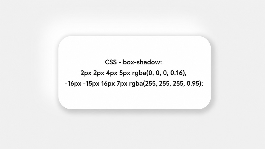
An example of the shadow generated by our tool
Box Shadow Syntax
A normal CSS box shadow uses this structure:
box-shadow: offset-x offset-y blur-radius spread-radius color;Example:
box-shadow: 0 8px 24px -6px rgba(0, 0, 0, 0.18);An inset shadow adds the word inset:
box-shadow: inset 0 4px 12px rgba(0, 0, 0, 0.2);Multiple shadows are separated by commas:
box-shadow:
  0 1px 3px rgba(0, 0, 0, 0.08),
  0 12px 32px -8px rgba(0, 0, 0, 0.18);
CalcuLife.com


Leave A Comment